


Cart 0
The perfect color combination can turn an ordinary room into an extraordinary room. Color shapes the way we perceive a space. Do you want your room to have an energetic vibe, or do you want it to be your quiet place to relax? There are countless color combinations out there. I advise my clients not to be afraid to take a risk and try something new in their vacation homes. This is the perfect place to embrace something a little different from your more permanent residence.
You may have heard of the 60-30-10 color rule for decorating. This rule guides you to choose one color as 60% of the space (usually your wall color), a secondary color as 30% of the space (maybe an accent wall or a large rug) then the final 10% is the spicy pop of an accent color. Of course, rules are made to be broken, but this formula is a safe place to start if you find yourself a little hesitant.
INSPIRATION IS EVERYWHERE
When creating color plates for a room, I love to start with an inspiration piece. This can be a rug, a work of art, your favorite fabric, or even a colorful shirt! It doesn’t matter what the inspiration is, as long as you love it, and it speaks to the overall feeling you are hoping to create in the room.
1. Pin-spiration
One of the easiest and most manageable ways of filtering through endless inspiration pieces is through Pinterest. I love to collect inspirational color palettes from all over the web and save them on my Pinterest boards. Pinterest is a useful tool to organize your thoughts and ideas for now or for later. By following accounts with similar interests as you, you can have a full feed of creativity. You can see some of our favorite hue selections here.
2. Wallpaper Hues
In the case of this coastal condo remodel, the wallpaper in the foyer was the inspiration piece for the color scheme throughout to entire home.
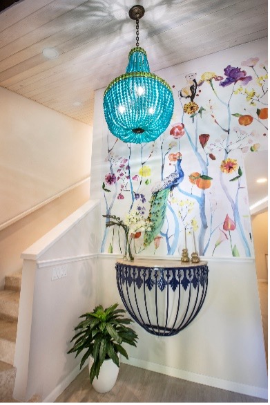
I love this choice because it invites all the colors in, and like a good party invitation, it sets the tone the minute you open the front door. Splashes of color combined with soft strokes of blues and a crisp white background bring a fresh and colorful union of elements. You can see more of this inspiration piece unfold here.
3. Design Seeds Color Palettes
Take the below Design Seeds image:
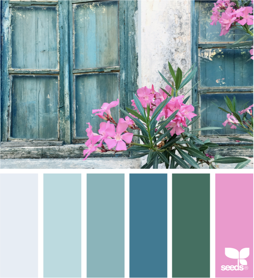
If you require some color inspiration, the Design Seeds site is another excellent resource. I love to use them as a library for extraordinary color combinations. How you put those combinations into action in your room is a whole different story!
To build a room around this image, I would start with the soft grey on the left as my wall color. You could shop for a deep-sea blue sofa, then add bright pink throw pillows. This is a perfect example of how an image can inspire the design of a room. From there, layer in some textural neutrals, and you’d have a stylish living space.
4. Color Pool from a Photograph
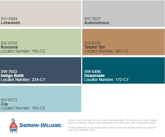
What about the reverse situation? What if you have a room image and you’d love to know more about the colors there? I have a lot of fun with the Sherwin Williams website.
You can upload a photo and select paint colors based on the image. You should always get a tester before going all-in with this method and painting your room, but it is a fun interactive guide to help get you started.
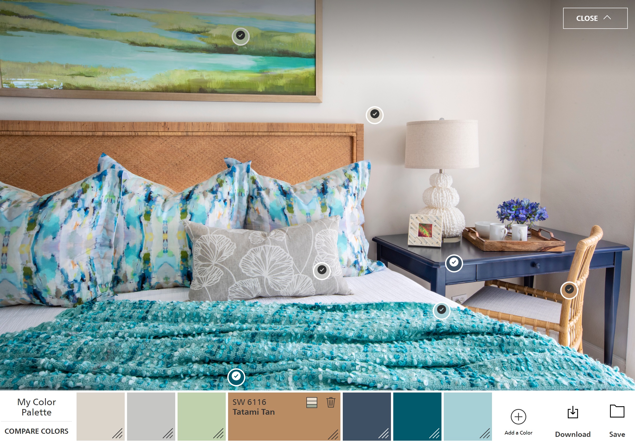
Here is a quick how-to on how to use the Sherwin Williams website. After you upload your image, you’ll see little circles populate that mark different color hues within your image. Drag the tiny spots around the photo to read the other shades, then add them to your final color palette. From here, you will be able to print a list of colors to try in your room based on an image that you love.
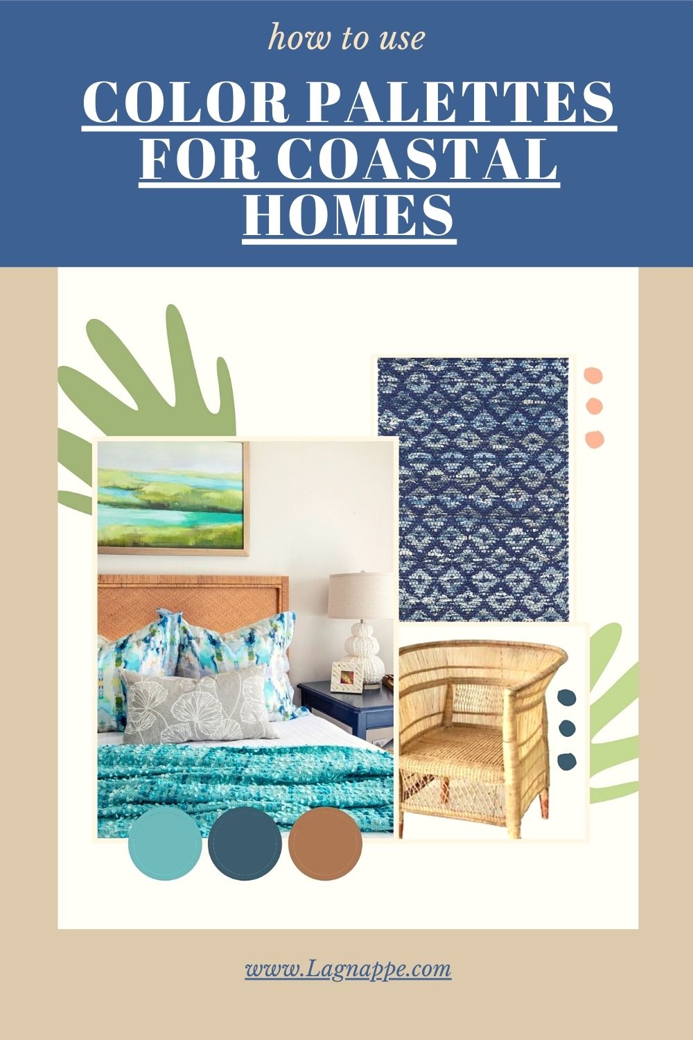
5. Fabric Inspiration
Here is what happens when you create a room color palette around a piece of fabric. This Thibaut print has always been one of my favorites.
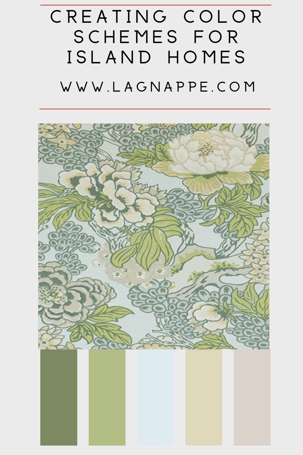
I can imagine a beautiful bedroom design based on this print! I’d use the robin’s egg blue as the room paint color, then upholster a headboard with the fabric. I would add some neutral draperies with trim in the deep green and possibly some nightstands in the fresh spring green hue paired with a soft, comfy chaise lounge in the peachy shade on the far right. Girly, I know, and I’m not sure my husband would agree to such a room, however! You get the idea, though. Working off something like a piece of fabric that you can see and feel for yourself can spark your senses for even more creative color possibilities.
So the next time you are deciding on a color scheme for your space, take a moment to be inspired. Let your creativity take your interiors to a whole new world of color possibilities that support your life and celebrate what you love. If you need some guidance on color selection for your vacation home or your primary home, connect with us today. We would love to collaborate and be inspired with you.


Hi Tiffany ~
What a fun post! I always enjoy learning about different ways to find color palettes, and especially now, as I’m seriously considering repainting my own interiors, and I can’t make up my mind! That Sherwin Williams tool looks like a winner! Thank you for showing me how to use it.
Tiffany, The colors here honestly just made me smile this morning! Beautiful!
Thanks!
Wonderful recommendations for coastal color palettes and where to find inspiration!
I love posts that inspire us to find the best color inspiration. Great post, I really enjoyed reading it!
Terrific ideas for creating a fresh color palette for a home! And the Sherwin Williams app is genius as a starting point – I didn’t know of that one!
Great ideas to source palettes and wow, Design Seeds – that’s a “rabbit hole” I didn’t know about. Thanks!
Great tips on inspiration. Color makes the magic happen!
It really does doesn’t it!
I love these approaches to creating a color palette. I did not know about the Sherwin Williams start with a photo approach, what a great tool.
It’s a lot of fun to play with, I’ve discovered new favorite paint colors this way a few times!
Beautiful color schemes, makes me want a coastal home!
Lovely color pallets!
Beautiful and inspiring color palettes! Than you for your wisdom!
This speaks to me in many ways. I love how you broke this down to showcase how to pull it all together.
Thanks Sheri!